Left to right: Daylight vs LED—the same paint, different look.
Yellow automotive paint: Why it shifts between green and orange
January 16, 2026
Yellow paint can look greenish or orangey because our eyes process it using both red- and green-sensitive cones. Depending on the light, it tilts warmer/red or cooler/green — and that sensitivity is also why yellow stays one of the most visible colors on the road.
Your coupe looks blazing yellow at noon, but by dusk it feels cooler, with a hint of green. That isn’t the paint changing — it’s your eyes. Human vision is most sensitive near yellow-green light wavelengths, so yellow reads bright by day and still stands out after reds fade at night. We explain how yellow works so you understand what makes it distinctive, and what to keep in mind as an owner.
Why yellow seems to “shift”
-
How our eyes read it. Yellow lives right between the cones that sense red and green. A tiny tilt in balance, and it leans warmer/orange or cooler/green, which is why the same paint can look different at noon and at dusk.
-
Why colors change with dusk (the Purkinje shift). This color shift was first described by Jan Purkyně (1787–1869), who noticed that reds fade while yellow-greens stay bright in twilight. In daylight our eyes peak near 555 nm; by dusk the peak slides toward 507 nm. It’s the same reason a walk at dusk looks lavender, and twilight slips into blue.
-
Lighting and metamerism. Metamerism is when two colors look the same in one light but different in another. That’s why a yellow that looks right in your garage can shift outdoors—LEDs, grass, or signage can make it go warmer or greener. It’s not bad paint, it’s light playing tricks on your eyes.
-
Why safety fleets love it. School buses and fire trucks use yellow because it stays visible when reds lose impact at dusk or under streetlights. The shade was standardized in the U.S. in 1939 for maximum driver visibility.
Yellow examples in the wild: You couldn’t miss these if you tried
-
Ferrari Giallo Modena (102/231259/4305). Ferrari’s signature solid yellow, long associated with the brand’s Modena roots. Brilliant in sunlight, but known for leaning warmer or cooler depending on conditions—a textbook case of yellow’s perceptual shifts..
-
Corvette C8 Stingray in Accelerate Yellow Metallic (GD0/WA622D). Introduced with the 2020 mid-engine Corvette, this vivid yellow was chosen for maximum visibility at speed and in low light. It shows how modern OEMs lean into yellow’s eye-catching qualities as both a style and safety choice.
- School Bus Yellow. Chosen for maximum daytime and dusk visibility, this shade proves how biology drives design. It remains one of the most recognizable uses of yellow in the world—a color you simply can’t miss.
Corvette C8 Stingray rendered in Accelerate Yellow—a modern high-visibility shade designed to stand out at speed and in low light.
The Purkinje Shift
At high noon, your eyes peak in sensitivity around 555 nm (yellow-green). As light fades, your sensitivity slides toward 507 nm (blue-green). The effect? Reds dim out at dusk, but yellows keep shining, and this is the shift in vision that Purkyně noticed. Today it’s called the Purkinje shift, and it’s why safety colors lean yellow-green for round-the-clock visibility.
Purkinje shift: Human vision peaks at yellow-green (~555 nm) in daylight, then shifts toward blue-green (~507 nm) at dusk. Reds (~625 nm) fade sooner, which is why yellow-green remains more visible at night.
Yellow automotive paint — at a glance
-
Build color in light coats. Yellows often look thin or greenish in early passes. Keep layers light and even—the true tone comes in as coverage develops.
-
Mind tri-coats. If your yellow has a pearl or tint mid-coat, small changes in coat count can shift the hue. Always test on a test card before touching the panel.
-
Primer is already matched. If your kit includes primer, it’s the correct undercoat from the OEM formula—no guessing needed. Skipping primer on bare metal or plastic is one of the few reasons yellow may look “off.”
-
Check under different lights. Because yellows sit between red and green in human vision, they can look warmer in daylight and cooler under LEDs. Always confirm your test card in both kinds of lighting before final application.
FAQ: Yellow automotive paint
Why does yellow sometimes look orange, sometimes green?
Yellow straddles red and green in human vision. Lighting shifts and film build can tilt it warmer or cooler.
Is yellow or red more visible on the road?
Red is attention-grabbing, but yellow-green stays brighter at dusk. Both are used in safety design.
What’s “school bus yellow,” and why that shade?
It was standardized in the U.S. in 1939 for maximum daytime visibility and dusk contrast.
Why does yellow look green in some lights?
Because our eyes shift sensitivity at dusk (Purkinje effect), and LED lighting can accentuate green tones.
Why does yellow sometimes look orange instead?
Cone balance tilts toward red under bright light, making yellow appear warmer.
Related mixing videos (yellow series)
Watch: Factory-accurate yellow mixing demonstrations from our technicians.
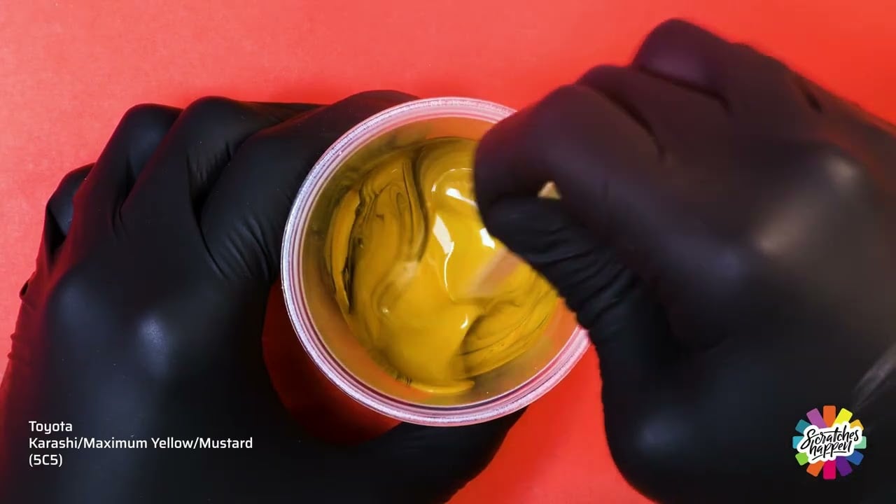
Toyota Karashi/Maximum Yellow/Mustard (5C5) — OEM Formula Color Mixing
Yellow mixing playlist: Watch the full playlist on YouTube →
Related content
Discover more stories exploring color — and the allure and armor of automotive paint.
- From the Color Series:
- Help Article: Applying Tri-Coat Layer 2, Metallic or Pearl Finish Paint – Read how metallic and pearl finishes are applied.
- Explore: Scratch Match — Compare real paint scratch photos to choose the right repair kit →
- Explore: Introduction to Human Vision and Color Perception — Evident Scientific – Read more about how humans perceive color and light.


