
Left to right: Green car paint in sunlight vs shade—the same panels, two personalities.
Left to right: Green car paint in sunlight vs shade—the same panels, two personalities.
January 15, 2026
Green paint blooms to life in sunlight because our vision peaks in sensitivity to green under bright light. In shade, that sensitivity drops and the finish recedes — the same car can swing from emerald to almost black, not from instability but from light and vision alone.
At noon, every leaf glimmers emerald; step into shade and those same leaves turn nearly black. Green only shows when there’s light to reflect, and car paint behaves the same way. That’s why we explain how green works — so you understand what makes it distinctive, and what to keep in mind as an owner.

Chart showing the Purkinje shift — under bright light, vision peaks at green (~555 nm), but at dusk it shifts toward blue (~507 nm), making greens fade faster than other colors.
We live in a green world—fields, forests, chlorophyll everywhere. Yet for centuries, green was one of the hardest colors to capture in art. Malachite and verdigris paints darkened, medieval yellow–blue mixes went muddy, and 19th-century arsenic greens were vivid but toxic. The irony? The color we see most easily in nature was the trickiest to stabilize on canvas, until modern chemistry solved it with phthalo greens. That breakthrough didn’t just change art: it carried straight into automotive paint, where the same pigments define how green behaves today.
That same struggle with green pigments carried over into automotive paint. Early “chrome greens” were vivid but short-lived—and made with lead chromate, a toxic pigment now heavily restricted. Mixed with Prussian blue to get that bright green, they faded quickly and posed health risks.
Today’s phthalo greens (short for phthalocyanine greens) are the safe, modern standard. They’re synthetic, lightfast, and powerful, but also transparent. That means painting with them is like working in layers of stained glass. Each thin layer builds depth, which is why the addition of every coat matters when repairing or touching up green paint.

Green paint acts like stained glass—luminous where light passes through, dark where it retreats.

Iconic Greens on the Road — From heritage depth to neon fire, these four shades show how green paint transforms with light.
Why does my green look almost black at night?
Our eyes lose sensitivity to green in low light, so deep greens retreat faster than other colors.
Do green paints fade faster?
Standard OEM greens are stable. Only neon or fluorescent greens fade quickly, which is why factories avoid them.
Why does my green look teal or blue under LEDs?
Light sources vary in spectrum. LEDs emphasize blue, which can tilt green finishes cooler.
Watch: Factory-accurate green mixing demonstrations from our technicians.
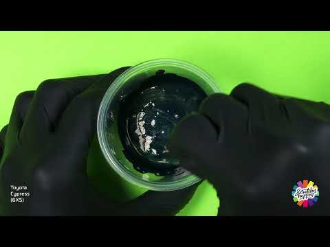
Toyota Cypress (6X5) — OEM Formula Color Mixing
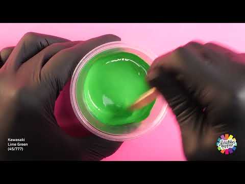
Kawasaki Lime Green (45/777) — OEM Formula Color Mixing
Green mixing playlist: Watch the full playlist on YouTube →
Discover more stories exploring color — and the allure and armor of automotive paint.